
Workflow · 7 min read
How to convert a PNG or JPG logo to SVG (and get clean results)
A tracer can only be as good as what you feed it. Ten minutes of care with the source file and two settings make the difference between a vector you can print on a banner and one you have to redraw.
01 · The source
Start from the best bitmap you can find
Most bad vectors were bad bitmaps first.
Before opening the converter, spend a minute hunting for the largest, cleanest version of the logo. In order of preference:
- An existing vector. Ask for the
.ai,.eps,.pdfor.svgthe logo was designed in. If it exists, tracing is unnecessary. - A PNG with a transparent background at 500–2000 pixels. PNG is lossless, so edges are exactly what the designer drew.
- A large JPG. Fine for flat-colour artwork above 800 px; the compression noise is small compared with the shapes. Below that, JPEG blocks and ringing become visible in the trace.
- A screenshot or a tiny web image. It works — small images are upscaled before tracing — but curves will be rounder and small text may merge.
Whatever you have, do not resize it in an image editor first. AnyToSVG traces at up to 2048 px and upscales small images itself with a filter chosen for tracing; an extra resample in between only adds blur.
02 · Drop it in
Let the auto-detection do the first pass
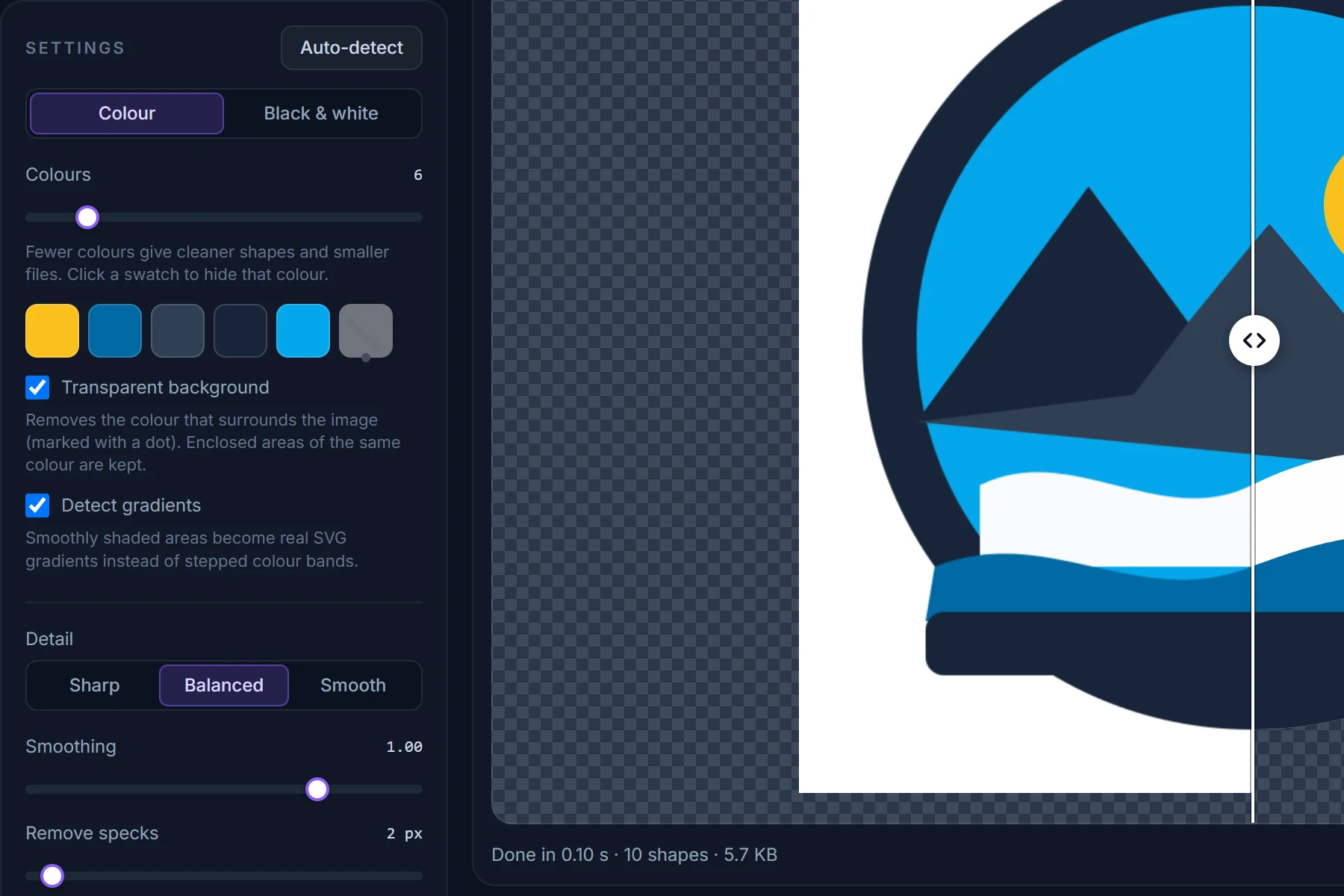
Drag the file onto the converter (or paste it with Ctrl+V). Within a second you will see the SVG next to the original, and the settings panel will show what was detected:
- Colour mode with a colour count equal to the number of distinct colours found — for most logos 2 to 8 — or
- Black & white mode if the image is a dark-on-light line drawing, with the threshold and the ink colour picked from the image.
Look at the swatch row. If it lists the colours you expect and nothing else, the hard part is done. If there is an extra swatch that is almost identical to another one, lower the colour count by one; if a colour you can see is missing, raise it.
03 · Background
Make the background transparent
One checkbox, and it knows the difference between "outside" and "inside".
A logo on a white (or any flat) background should almost always be delivered without it. Tick Transparent background: the colour touching the image border — marked with a dot in the swatch row — is removed from the SVG.
Only the outer region goes. If the logo itself contains the same colour — white lettering on a white background, a white highlight inside a shape — those enclosed areas are kept, because they are not connected to the border. Switch the preview backdrop to dark (the square buttons above the preview) to make sure nothing important disappeared.
To drop any other colour, click its swatch: it turns grey with a line through it and its shapes vanish. Click again to bring it back. This is the quick way to remove a drop shadow, a stray scan artefact, or a colour that only exists because of anti-aliasing.
In black-and-white mode the background is transparent by definition — only the dark (or, with Invert, the light) shapes are traced.
04 · Edges
Fixing jagged, bumpy or broken edges
Zoom in on the preview (scroll over it, or press +) and inspect a curve and a corner. Then:
- Wobbly curves — the source is small or compressed. Raise Smoothing or choose the Smooth preset. If it is a JPG, also tick Smooth noise first under Advanced.
- Rounded-off corners that should be sharp — lower Smoothing or choose Sharp. Potrace decides per corner; values below 0.5 keep nearly all of them.
- Dust and tiny islands — raise Remove specks. Anything smaller than that many source pixels is ignored. 2 px clears anti-aliasing debris; scans may need 10 or more.
- Thin lines that break up — they are probably thinner than the speck size, or a colour got merged into its neighbour. Lower Remove specks, or raise the colour count by one.
05 · Colours
Getting the colour count right
Each colour becomes one path, so the count is also the biggest lever on file size and cleanliness. Rules of thumb:
- Flat logo: exactly as many colours as the design has. The auto-detection usually gets this right.
- Logo with a gradient: leave Detect gradients ticked. A smoothly shaded area is fitted with a linear or radial gradient and written as one shape with a real
<linearGradient>/<radialGradient>fill — the swatch row shows it as a gradient swatch. The colour count then only applies to the flat parts. If a gradient is not picked up (heavy JPEG noise, or shading that bends around a shape), tick Smooth noise first; failing that, raise the colour count and the shading becomes bands you can rebuild in your vector editor. - Photo or painting: 12–32 for a posterised look. See what tracing can and cannot do.
Leave Colour layers on Stacked unless you intend to cut the shapes physically or pull them apart in an editor; it is what prevents hairline gaps between adjacent colours.


06 · Check and deliver
Before you send it anywhere
Thirty seconds of checking saves a reprint.
- Drag the divider across the whole image in Compare view. Anything that changes shape as the line passes over it deserves a closer look.
- Zoom to 400 % on the smallest text or thinnest line. If it is legible here, it will be legible on the banner.
- Read the numbers in the Result panel. A clean logo is a handful of shapes and a few kilobytes; hundreds of shapes usually mean noise, a JPG, or too many colours.
- Download the SVG, then open it once in a browser or vector editor. The file is plain: one
<path>per colour with afill, in the original pixel coordinates, no groups or transforms — easy to recolour by hand. - If someone needs a bitmap after all, use the PNG 2× or 4× buttons: they render from the vector, so the result is sharper than the file you started with.
And if the result is not good enough — a very blurry source, a photo of a business card, a logo with soft shadows — that is your signal to redraw. Tracing produces a faithful copy of what is there; it cannot invent what was never in the pixels.
Try it as you read
The converter is free, needs no account, and shows the SVG next to your original in about a second.